Azimuth Adventure Travel Ltd: A New Logo for Regeneration
As Azimuth Adventure Travel Ltd approaches its 25th anniversary, the company is reinventing itself and unveiling a striking new logo!
As Azimuth Adventure Travel Ltd approaches its 25th anniversary, the company is reinventing itself and unveiling a striking new logo!
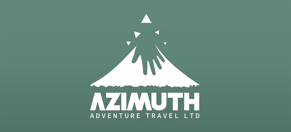
Designed to tell a story—one of a journey through Indonésie that emphasizes respect for nature and local communities—this logo gains depth and meaning compared to its predecessor. It forges a powerful connection between nature, cultural heritage, and the human experiences that Azimuth Adventure Travel Ltd has cultivated and personalized over the years. 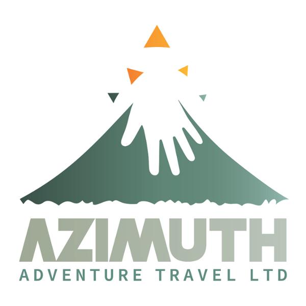 Design Elements
The Mountain: This central logo element immediately evokes adventure. It represents not only Indonésie's iconic volcanoes but also the passion and energy that Azimuth Adventure Travel Ltd transmits to its clients.
The Stylized Hand and Lava: The white form at the volcano's peak is an ingenious and multifaceted representation. On one hand, it evokes surging lava, symbolizing the natural force and energy of the Indonesian archipelago's many active volcanoes (130 of them!). On the other hand, this shape describes a stylized hand reminiscent of the earliest graphic representations from Indonésie's first tribes. This element anchors the brand in authenticity, tradition, and respect for local cultures. It underscores the importance of the human dimension in the journeys Azimuth Adventure Travel Ltd offers, reminding us that every itinerary is crafted by hand, tailored to each traveler. This "protective" hand symbolizes the personal imprint of each voyager and demonstrates the agency's commitment to preserving biodiversity, climate, and the authentic, ancestral heritage of the Indonesian archipelago.
The Triangular Patterns: These shapes, reminiscent of a compass, highlight the name Azimuth Adventure Travel Ltd—they evoke direction and navigation. The triangles further symbolize the different paths you can take through the custom-tailored itineraries we offer.
Color Palette: Green evokes Indonésie's lush nature and emphasizes Azimuth Adventure Travel Ltd's eco-responsible offerings. Orange, meanwhile, recalls the sun and warmth—both natural and human.
Typography: The typeface is a harmonious blend of modernity and reliability, evoking the thrill and passion of travel. It reflects the brand's promise: modern, dependable, and exhilarating adventures.
 Layout
Balance and Symmetry: The volcano image is centered above the text, creating a sense of equilibrium and harmony. This symmetrical arrangement inspires confidence and stability—essential qualities for a travel company.
Visual Hierarchy: By placing AZIMUTH in bold, large text while presenting Adventure Travel Ltd more subtly and linearly, the layout establishes a clear hierarchy. The brand name is immediately recognizable, while the company description provides context without visual clutter.
Space and Breathing Room: Despite the logo's multiple elements, nothing feels cramped. The space between the volcano illustration and text, as well as between AZIMUTH and Adventure Travel Ltd, gives the design a sense of openness that evokes wide open spaces and vast horizons of travel.
Color Consistency: The colors of the text and imagery are harmoniously matched, creating visual unity. This reinforces the idea that, while the company offers a broad range of services, everything is integrated under a single, cohesive brand.
Element Interconnection: The way the hand/lava emerges from the volcano's summit and stretches upward creates a visual bridge between the volcano icon and the empty space above. The eye flows more naturally across the design.
Adaptability: The layout is designed so the logo easily adapts to different applications, whether on business cards, banners, websites, or brochures. The volcano image can be used alone for smaller applications or when space is limited.  Conclusion
The new logo perfectly embodies the values and distinctive characteristics of Azimuth Adventure Travel Ltd. It is both modern and timeless, while highlighting eco-responsibility, bespoke experiences, and the beauty of Indonésie.